
The way digital interfaces are created has evolved significantly over the past few decades. Early web and software design relied heavily on fixed measurements, particularly pixel-based layouts, to ensure visual precision and consistency. However, as technology advanced and the number of devices multiplied ranging from smartphones and tablets to ultra-wide monitors and wearable screens the limitations of rigid pixel-based design became increasingly apparent. This shift in technological diversity gave rise to a new approach known as pxless, a philosophy centered on flexibility, scalability, and adaptability rather than fixed measurements.
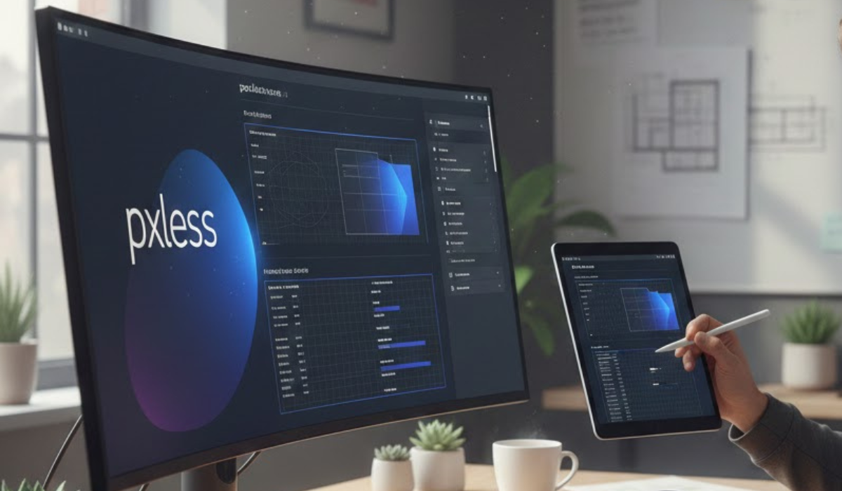
Pxless is not simply a technical technique; it represents a mindset change in how designers and developers think about digital environments. Instead of defining elements with exact pixel values, pxless encourages the use of relative measurement systems that allow interfaces to respond naturally to different screen sizes, resolutions, and user contexts. The result is a more fluid user experience that prioritizes usability across devices without sacrificing visual coherence.
Understanding the Concept of Pxless
At its core, pxless is about moving away from the traditional reliance on pixels as the primary unit of measurement. Pixels are static units what looks perfect on one screen may appear too small, too large, or poorly spaced on another. In contrast, pxless systems rely on dynamic units such as percentages, ems, rems, and viewport-based measurements. These units adjust according to the environment, meaning the interface scales automatically without requiring multiple rigid layouts.
This approach aligns with the broader evolution toward responsive and adaptive design. While responsive design introduced flexible grids and media queries, pxless extends the concept further by emphasizing relative sizing as a foundational principle rather than a supplementary technique.
Why Pixel-Based Design Became Limiting
Pixel-based design worked well during the early years of the internet when screen sizes were relatively standardized. Designers could create a layout at a fixed width and trust that most users would see it similarly. However, several technological changes disrupted this assumption:
- Device Diversity – Modern users access content on phones, tablets, laptops, desktops, TVs, and even smartwatches.
- Resolution Variations – High-density displays and varying pixel ratios mean that the same pixel value can appear differently across devices.
- Accessibility Needs – Users may adjust text sizes or zoom levels, which can break rigid layouts.
- User Context – Environmental factors such as lighting conditions or viewing distance influence usability.
Pxless addresses these challenges by designing interfaces that adapt naturally rather than forcing users into a predetermined visual structure.
Core Principles of Pxless Design
The pxless philosophy is guided by several key principles that shape how interfaces are built:
1. Fluidity Over Rigidity
Instead of defining exact dimensions, pxless promotes layouts that flow and adjust based on available space. Elements resize proportionally, maintaining balance regardless of screen size.
2. Relative Measurement Systems
Units like percentages, ems, rems, and viewport units allow components to scale dynamically. For example, typography can grow relative to screen size, improving readability across devices.
3. Device Independence
A pxless interface does not assume a specific device or resolution. It is built to function consistently across environments, from small mobile screens to large displays.
4. Content-First Approach
Rather than designing around fixed containers, pxless prioritizes content. Layout decisions are guided by how information should be consumed, not by arbitrary measurements.
5. Accessibility and Inclusivity
Flexible systems accommodate user preferences, such as larger text settings or zoom adjustments, making digital products more inclusive.
Benefits of Adopting Pxless
The pxless approach offers several advantages that make it increasingly appealing in modern digital design.
Improved Scalability
Because pxless relies on relative units, designs can scale easily without requiring multiple versions for different devices. This reduces development complexity and maintenance effort.
Enhanced User Experience
Users experience consistent usability regardless of device type. Text remains readable, spacing stays balanced, and interactive elements maintain appropriate proportions.
Future-Proofing Designs
Technology continues to evolve rapidly. Pxless designs are more resilient to future device changes because they are not tied to fixed measurements.
Better Accessibility
Flexible sizing allows users with visual impairments or other accessibility needs to interact with content more comfortably.
Efficient Development Workflow
Designers and developers can focus on systems rather than pixel perfection. This encourages modular thinking and reusable components.
Practical Applications of Pxless
Pxless principles can be applied across various digital environments:
Web Design
Modern websites often need to support multiple devices and resolutions. Pxless layouts ensure that navigation, typography, and images adapt seamlessly.
Mobile Applications
Mobile devices vary widely in screen size and density. Pxless approaches help maintain consistency across platforms without extensive redesign.
Software Interfaces
Applications used on desktops, tablets, and hybrid devices benefit from flexible scaling that preserves usability in different contexts.
Emerging Technologies
Virtual reality, augmented reality, and wearable technology introduce new interaction environments. Pxless thinking supports adaptability in these evolving spaces.
Challenges and Considerations
While pxless offers many advantages, it also presents challenges that designers and developers must address.
Learning Curve
Professionals accustomed to pixel-based workflows may need time to adjust to relative measurement systems and fluid design thinking.
Testing Complexity
Ensuring consistent behavior across numerous devices and screen conditions requires thorough testing.
Design Precision Concerns
Some projects demand strict visual control, such as branding-heavy interfaces. Balancing flexibility with brand consistency can require careful planning.
Performance Factors
Dynamic scaling systems must be implemented efficiently to avoid performance issues, particularly on lower-powered devices.
Despite these challenges, the long-term benefits often outweigh the initial adjustments required.
The Future of Pxless Design
As digital ecosystems continue to expand, the need for adaptable design systems will only grow. Pxless represents a forward-thinking approach that aligns with emerging technological trends, including:
- Multi-device ecosystems
- Responsive and adaptive frameworks
- Accessibility-focused design standards
- Immersive and spatial computing environments
Over time, pxless may become less of a specialized philosophy and more of a standard practice, much like responsive design did in previous years. Its emphasis on flexibility and user-centered thinking positions it as a natural evolution in digital design methodology.
Conclusion
Pxless is more than a technical adjustment it is a conceptual shift toward designing experiences that adapt to users rather than forcing users to adapt to interfaces. By moving away from fixed pixel measurements and embracing relative systems, designers can create digital products that are more scalable, inclusive, and future-ready.
In an increasingly complex digital landscape filled with diverse devices and user needs, pxless offers a practical and forward-looking solution. As more professionals adopt its principles, the digital world may become more fluid, accessible, and responsive to the people who interact with it every day.
FAQs About Pxless
1. What does pxless mean in design?
Pxless refers to a design philosophy that avoids fixed pixel measurements and instead uses flexible, relative units to create adaptable digital interfaces.
2. Is pxless the same as responsive design?
Not exactly. Responsive design focuses on adjusting layouts for different screen sizes, while pxless emphasizes using relative measurements as a foundational approach rather than relying on fixed values.
3. Why is pxless important for modern devices?
Modern devices vary greatly in size and resolution. Pxless ensures interfaces remain usable and visually consistent across these differences.
4. Can pxless improve accessibility?
Yes. Because pxless allows elements to scale dynamically, it supports user preferences such as larger text sizes or zoom adjustments, improving accessibility.
5. Do designers completely avoid pixels in pxless?
Not necessarily. Pixels may still be used in certain cases, but the overall system prioritizes flexible units to maintain adaptability.
6. Is pxless difficult to implement?
It may require a learning curve, especially for those used to pixel-based workflows, but many modern tools and frameworks support relative measurement systems.
7. Will pxless replace pixel-based design entirely?
Pixels are unlikely to disappear completely, but pxless principles are expected to play a larger role as digital environments continue to diversify.